All the design patches are added to the Design page group patch.
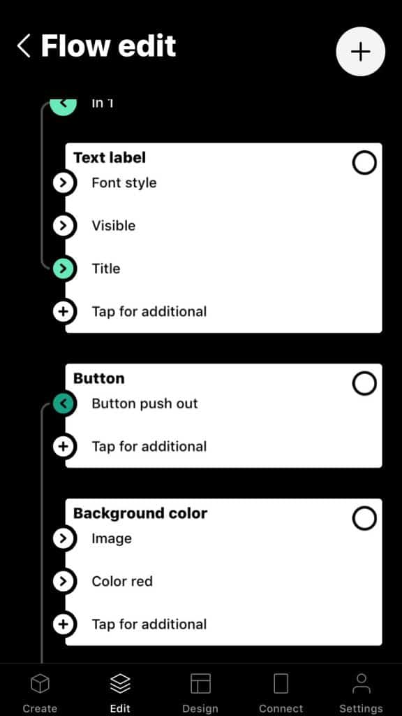
A button patch has an output where a value is sent when the button is pushed.
A text label patch has an input to set the text it displays.
Each design patch has different settings that defines the look and function of its corresponding UI component, such as background color of a button or text color of a text label.
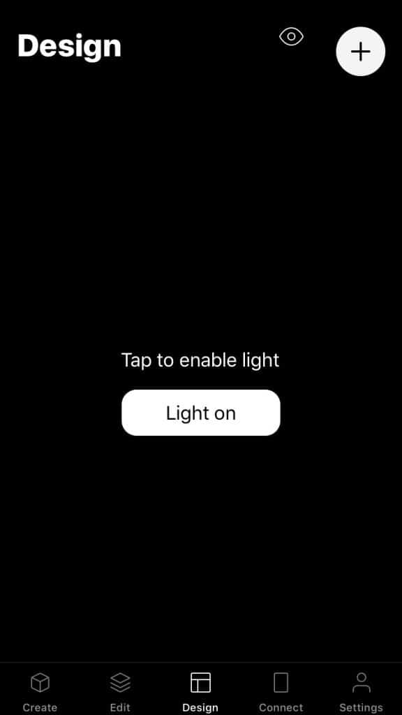
The image below shows the design view with a button, a text label and black background color.

The image below shows the patches that represent the UI components. The button patch has a connection from Button push out.
